

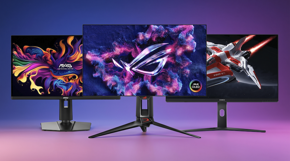
A monitor is the window through which you see everything your computer does, and a good one makes work, play and streaming more comfortable for years.
A poor one can cause eye strain, washed-out colors and a constant feeling that something is wrong. In this article we will discuss how screen size, resolution, refresh rate, panel type, brightness, color and connections fit together, so you can match a monitor to your desk, your computer and your daily habits without paying for features you will never use.
Start with your desk, distance and daily tasks
The best monitor for one person can be a poor choice for another, so begin with the place where the screen will sit. Measure the width and depth of your desk and the distance between your eyes and the screen. Most people sit roughly an arm’s length away, which is often around fifty to eighty centimeters, and that distance helps decide how large a screen is comfortable. A very large monitor on a shallow desk forces you to turn your head constantly, and that gets tiring quickly.
Next, list the tasks you do on the monitor. Office work and reading reward sharp text, photo and video work rewards accurate color, gaming rewards a high refresh rate, and films reward good contrast. Most people mix several of these, so rank them and make sure the monitor you choose does your top two jobs well, even if it is only average at the others.
A modest laptop may struggle to run a very high-resolution display at a high refresh rate, and an older graphics chip may lack the output needed for a certain panel. Check the ports on your computer and the maximum resolution and refresh rate it supports through each one. This simple step avoids the frustrating situation where a new monitor works, but only at a lower setting than you paid for.
Space and lighting also matter. A desk placed near a bright window will wash out a dim glossy screen, while a dark room makes a very bright screen uncomfortable. If your desk faces a window, a matte finish and higher brightness help. If you work in a dim room, you may value a screen with good contrast and the ability to dim comfortably at night.
Finally, decide whether you want one monitor or several. Two matching monitors side by side are popular for work, while one large or ultrawide screen suits people who prefer a single continuous space. Matching sizes and resolutions across two screens makes windows move between them smoothly. A monitor that rotates into portrait mode is handy for reading documents and code, so check the stand if that appeals to you.
Screen size and resolution work together
Size is measured diagonally in inches, and the common range for desks runs from about twenty-two to thirty-two inches. Screens near twenty-four inches suit small desks and close viewing. Screens around twenty-seven inches are a popular middle ground, giving more room for windows without forcing you to move your head. Larger screens suit people who sit farther back, share a view with others or want an immersive picture for games and films.
Resolution is the number of pixels, written as width by height. Full high definition, often called 1080p, uses 1920 by 1080 pixels and looks good on screens up to about twenty-four inches. Quad high definition, often called 1440p, uses 2560 by 1440 pixels and is widely seen as a comfortable match for twenty-four to twenty-seven inches. Ultra high definition, often called 4K, uses 3840 by 2160 pixels and gives very sharp text and pictures, especially on larger screens.
Choosing resolution means balancing sharpness against cost and computer workload. Higher resolutions need more graphics power, especially for games, and they require cables and ports that can carry the data. For office work, a higher resolution brings crisp text that is easier on the eyes over long days. For gaming on a modest computer, a lower resolution with a higher refresh rate often feels better than a very sharp image that runs slowly.
Ultrawide monitors use a wider shape, commonly a ratio of twenty-one to nine, and they replace two smaller screens with a single continuous view. They are excellent for spreadsheets, timelines in video editing and immersive games. Their drawbacks are that some videos show black bars on the sides, some applications handle the width poorly, and they need a deep desk. Super-ultrawide models stretch the idea further and are best reserved for people with a clear use for them.
The aspect ratio matters as well. The traditional widescreen shape, sixteen to nine, suits video and games, while taller ratios such as sixteen to ten give extra vertical room for documents and web pages. When comparing two screens of the same diagonal, the taller one shows more lines of text. It is a small difference on paper that feels pleasant during daily reading and writing.
| Resolution | Pixels | Typical size that suits it | Best for |
| Full high definition (1080p) | 1920 by 1080 | Up to about 24 inches | Budget office work and light gaming |
| Quad high definition (1440p) | 2560 by 1440 | About 24 to 27 inches | General use, gaming and mixed work |
| Ultra high definition (4K) | 3840 by 2160 | About 27 inches and above | Sharp text, photos, video and films |
| Ultrawide quad | 3440 by 1440 | About 34 inches | Multitasking and immersive games |
Pixel density and scaling for sharp text
Pixel density describes how many pixels fit into each inch of the screen, and it explains why the same resolution can look sharp on a small monitor and soft on a large one. A commonly cited comfortable range for desktop work sits roughly between ninety and one hundred and forty pixels per inch, depending on viewing distance. Below that range, you may see individual pixels and jagged text. Well above it, the improvement becomes hard to notice unless you sit very close.
You can estimate density yourself by dividing the diagonal pixel count by the diagonal size in inches. For example, a twenty-seven inch screen at 1440p works out to roughly one hundred and ten pixels per inch, while a twenty-seven inch 4K screen is about one hundred and sixty-three. The 4K screen looks crisper, but the text will appear tiny without scaling. This calculation helps you compare monitors of different sizes more fairly than the resolution name alone.
Scaling is the setting in your operating system that enlarges text and interface elements so they stay readable on dense screens. Common scaling steps include one hundred, one hundred and twenty-five, one hundred and fifty and two hundred percent. Integer steps such as two hundred percent tend to look cleanest, while in-between values can make some older programs look slightly blurry. Most modern systems and programs handle scaling well, but it is worth knowing the choice exists.
When you use a laptop alongside a monitor, scaling can differ between the two screens, which sometimes makes windows change size as you drag them across. Modern systems handle this better than they used to, but occasional oddities remain. If you plan to connect a laptop, check reviews or user comments about scaling behavior with your operating system. Choosing a monitor whose density is similar to your laptop screen reduces the mismatch.
Text clarity also depends on how the screen lays out its colored subpixels. Most panels use a standard stripe pattern that systems are tuned for, while some OLED panels use a different arrangement that can make small text look slightly fuzzy. Reviews that comment on text clarity are worth reading if you spend most of your day reading and writing. Look for sample photos of text on the screen, and if possible view the monitor in a shop before buying.
Refresh rate and response time explained
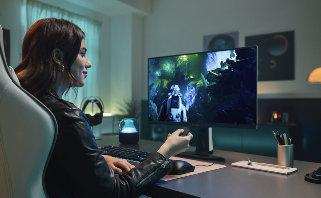
Refresh rate is the number of times the screen redraws its image each second, measured in hertz. Standard monitors refresh sixty times per second, which is fine for documents, web browsing and video. Higher-rate screens, commonly one hundred and twenty, one hundred and forty-four, one hundred and sixty-five hertz or more, make cursor movement, scrolling and fast action look smoother. Many people notice the difference immediately when moving a window or scrolling a page.
A high refresh rate helps only if your computer sends enough frames. A game running at sixty frames per second on a one hundred and forty-four hertz monitor will look no smoother than on a sixty hertz screen. Before paying extra, check what frame rates your computer reaches in the games or programs you use. For office work and streaming, there is little reason to pay for a high refresh rate beyond the pleasure of smoother scrolling.
Response time measures how quickly a pixel changes from one color to another, usually quoted in milliseconds. Slow response creates smearing or ghosting behind moving objects, which is noticeable in fast games and sports. Manufacturers often quote an optimistic figure measured in the best possible conditions, so it is better to compare reviews that test real transitions. A low number on the box is not proof of a clean image, because aggressive speed settings can create bright halos behind moving objects.
Adaptive sync technology lets the monitor match its refresh rate to the frames your graphics chip produces, which removes tearing, the horizontal split sometimes seen in games. Several brand names exist for it, and many monitors work with more than one. Check that your graphics hardware supports the version offered by the monitor. It is a helpful feature for gamers and mostly irrelevant for office use.
Input lag is the delay between pressing a button and seeing the result, and it matters for competitive games and for anything where timing counts. It is often poorly reported by manufacturers, so look for independent measurements. For general use, modern monitors respond quickly enough that you will not notice. Television modes and heavy image processing are the usual causes of extra lag, and most monitors offer a mode that switches them off.
Panel types compared: IPS, VA, TN and OLED
The panel is the technology that creates the image, and it affects color, contrast, viewing angle and speed. The three most common liquid crystal types are IPS, VA and TN, and a growing number of monitors use OLED. Each has strengths and weaknesses, and no type wins everywhere. Knowing the character of each helps you read a specification sheet with confidence.
IPS stands for in-plane switching. These panels give wide viewing angles, good color and consistent quality when viewed from the side, which makes them a popular all-round choice for office work, photo editing and general use. Their main weakness is lower contrast, so blacks look more like dark gray in a dim room, and many show a faint glow in the corners when the screen is dark. Modern IPS panels are also fast enough for most games.
VA stands for vertical alignment. These panels offer much higher contrast than IPS, so blacks look deeper and films look richer in a dark room. They have narrower viewing angles than IPS, and colors can shift when you sit off to the side. Some VA panels respond more slowly in dark scenes, which can cause smearing in fast games, although newer ones have improved. Curved screens commonly use VA panels, and the curve helps reduce the viewing angle problem.
TN stands for twisted nematic, the oldest of the three. These panels are very fast and inexpensive, which once made them popular for competitive gaming. Their colors and viewing angles are weaker than IPS and VA, and the image can change noticeably if you move your head. Today, fast IPS panels have narrowed the speed gap, so TN is usually worth considering only in very cheap models or in specialist competitive monitors.
OLED panels make their own light in every pixel, so black pixels are truly off. This gives extremely high contrast, vivid color and very fast response. The trade-offs include higher prices, a risk of permanent image retention, often called burn-in, if static elements stay on screen for long periods, and sometimes lower brightness in large bright scenes. Using screen savers, hiding the taskbar and varying content reduces the risk. Check the warranty terms for burn-in, because they differ widely between makers.
| Panel type | Strengths | Weaknesses | Good fit for |
| IPS | Wide viewing angles, good color | Lower contrast, possible corner glow | Office, photo editing, mixed use |
| VA | High contrast, deep blacks | Narrower angles, slower dark transitions | Films, dim rooms, curved screens |
| TN | Fast response, low price | Weak color and viewing angles | Tight budgets, esports |
| OLED | Perfect blacks, vivid color, fast | Higher cost, burn-in care needed | Films, games, content creation |
Brightness, contrast and HDR claims
Brightness is measured in nits, also called candelas per square meter. A commonly recommended range for comfortable indoor use is around 250 to 350 nits, and brighter panels help in sunlit rooms. Very high brightness is mostly useful for high dynamic range content and for rooms with strong light. At night you will want to turn brightness down, so check that the monitor can dim to a comfortable level without relying on flicker.
Contrast ratio compares the brightest white to the darkest black the screen can produce. Typical IPS panels reach around one thousand to one, VA panels often reach three thousand to one or more, and OLED panels have extremely high figures because black pixels switch off. Manufacturers also quote dynamic contrast numbers in the millions, which are mostly marketing and say little about picture quality. Rely on the native contrast figure, or on reviewers’ measurements.
High dynamic range, or HDR, is meant to show brighter highlights and darker shadows in the same picture. Many monitors carry an HDR label while lacking the brightness and local dimming needed to deliver the effect. The result can look dull or washed out, and in some cases worse than ordinary mode. A good HDR experience needs high peak brightness, many dimming zones or per-pixel lighting as on OLED, and wide color coverage.
Certification tiers exist to describe HDR capability, but the lowest tiers promise little. Read independent measurements of peak brightness and local dimming rather than trusting the logo. If you mainly work with documents and browse the web, you can safely ignore HDR and put the money toward resolution or panel quality. If you watch films or play games that support HDR, plan to spend more or choose OLED.
Coatings influence perceived brightness and contrast. Matte coatings spread reflections and reduce glare, but they can slightly soften fine detail. Glossy coatings look richer and sharper, but they reflect windows and lamps. Think about your room before choosing, and if you cannot control the light, matte is usually the safer option.
Color coverage and accuracy for photos and video
Color gamut describes the range of colors a monitor can show. The standard most web content uses is called sRGB, and nearly all decent monitors cover most or all of it. Wider gamuts, such as DCI-P3 and Adobe RGB, matter for people who edit photos for print, grade video or work with wide-gamut content.
Coverage is stated as a percentage, and higher numbers mean more of that color space can be displayed.
Accuracy is a different idea from coverage. A monitor can cover a wide range of colors yet display them incorrectly out of the box, with greens too strong or skin tones off. Accuracy is usually measured as a color error value, where lower is better, and some monitors ship with a factory calibration report. For creative work, look for factory calibration and consider a hardware calibration device, which measures the screen and builds a correction profile.
Other details influence color work. Panel uniformity, meaning how even the brightness and color look across the screen, matters for editing, and cheap panels often have uneven corners. Bit depth, usually eight bits or ten bits, affects how smoothly gradients appear and how much banding you see in skies and shadows. Some monitors reach ten bits through a technique that rapidly alternates between nearby colors, which is acceptable for most users.
If you do not edit photos or video professionally, you do not need the most expensive color features. A decent IPS or OLED panel with good sRGB coverage is enough for family photos, streaming and web work. Use the monitor’s presets sensibly: a standard or sRGB mode is usually closest to correct, while vivid modes exaggerate color. Keep the room lighting steady, since strong colored light changes how you perceive the screen.
Remember that the image you see on one screen may look different on a phone or another monitor. If you share photos, check them on other devices, and avoid pushing saturation just because your screen looks flat. A modest calibration habit, repeated every few months, keeps the display close to the intended look.
Connections, stands and eye comfort features
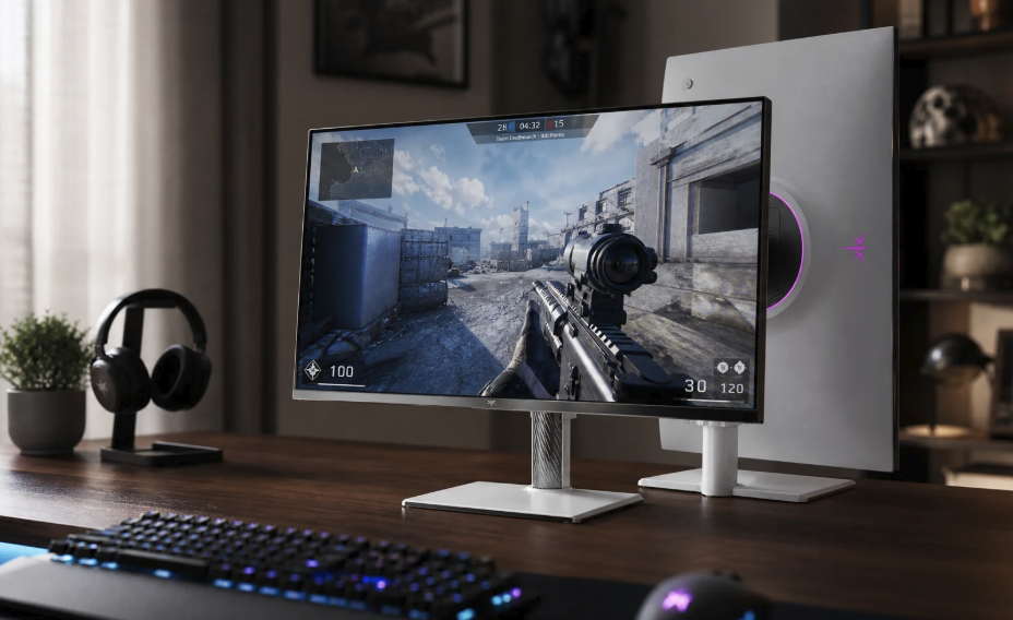
Ports decide whether the monitor works with your equipment at the quality you paid for. HDMI is found on almost every computer, console and television device, while DisplayPort is common on desktop graphics cards and often carries high refresh rates more reliably. USB-C with video support can carry picture, data and charging through one cable, which is a great convenience for laptops. Check which version each port supports, because older versions limit resolution and refresh rate.
Cables matter more than people expect. An old or low-quality cable can cause flicker, dropouts or a lower refresh rate than the monitor supports. Use the cable supplied with the monitor when possible, and if you buy a replacement, choose one rated for the bandwidth you need. If you want a laptop to charge while it feeds the screen, confirm the monitor delivers enough power for your laptop through that single connection.
Many monitors include a USB hub, speakers and a headphone jack. A built-in hub lets you plug a keyboard, a mouse and a drive into the monitor and connect everything to the computer with one cable. Built-in speakers are usually thin and best treated as a backup. Some monitors include a switch for sharing a keyboard and mouse across two computers, which is very handy in a work-from-home setup.
The stand affects posture. A good stand adjusts for height, tilt and swivel, and ideally rotates into portrait mode. Many people set the top edge of the screen at or slightly below eye level, with the screen about an arm’s length away, as commonly recommended ergonomic guidance. If the included stand is limited, check that the monitor supports a standard wall or arm mount, usually 75 by 75 or 100 by 100 millimeters, which opens the door to a cheap monitor arm.
Eye comfort deserves its own checklist. Look for flicker-free backlighting, since rapid unseen flicker bothers some people, and for a low blue light setting if you use the monitor late in the evening. A matte coating and the ability to dim easily help too. Remember that settings do not replace good habits: the widely suggested 20-20-20 rule, looking at something about twenty feet away for twenty seconds every twenty minutes, reduces strain. If you have persistent eye discomfort, headaches or changes in vision, see an eye care professional.
Conclusion: What to do before you buy
Start by writing down your desk space, viewing distance, computer ports and main tasks. Then choose size and resolution as a pair: for most people a twenty-four to twenty-seven inch screen at 1440p is a comfortable middle, with 4K worth the extra cost if you read a lot of text or edit images. Pick a panel type that fits your priorities, with IPS as the safe default, VA for contrast and OLED if your budget allows and you accept the care it needs. Add a high refresh rate only if your computer and your habits can use it.
Next, shortlist three or four monitors and read independent reviews that publish measured brightness, contrast, color accuracy, response time and input lag. Compare ports and stand adjustment, and check that the cables included match the ports on your computer. Look at the warranty terms, including how the maker treats dead pixels and, for OLED, burn-in, because policies differ by brand and country. Buy from a seller with a clear return policy so you can test the monitor at your own desk.
When the monitor arrives, set it up carefully. Place it at a comfortable height and distance, connect it with the right cable, and set the resolution and refresh rate to the highest values in your operating system settings, since a new screen is sometimes left on a lower default. Choose a sensible scaling level, switch the monitor to a standard color mode, and lower the brightness until white pages look like paper in the room instead of a lamp. Look at a plain white, black and gray screen to spot dead pixels or uneven lighting during the return window.
Finally, treat comfort as the real test. Use the monitor for several days of normal work, notice whether text looks sharp, whether your eyes feel tired and whether the posture is natural, and adjust the stand, the distance and the settings. If something feels wrong and cannot be fixed, return it while you still can. A monitor that fits your desk and your tasks will serve you well for many years, and it is often a longer-lived purchase than the computer behind it.